
Project Story · Millwork
Personal residence · 1952 farmhouse · California
How a Small Farmhouse Entry Became a Room of Its Own
Hand-built wall paneling, repurposed antique pantry doors, and the details that made a 1952 California farmhouse more welcoming.
View the California farmhouse project book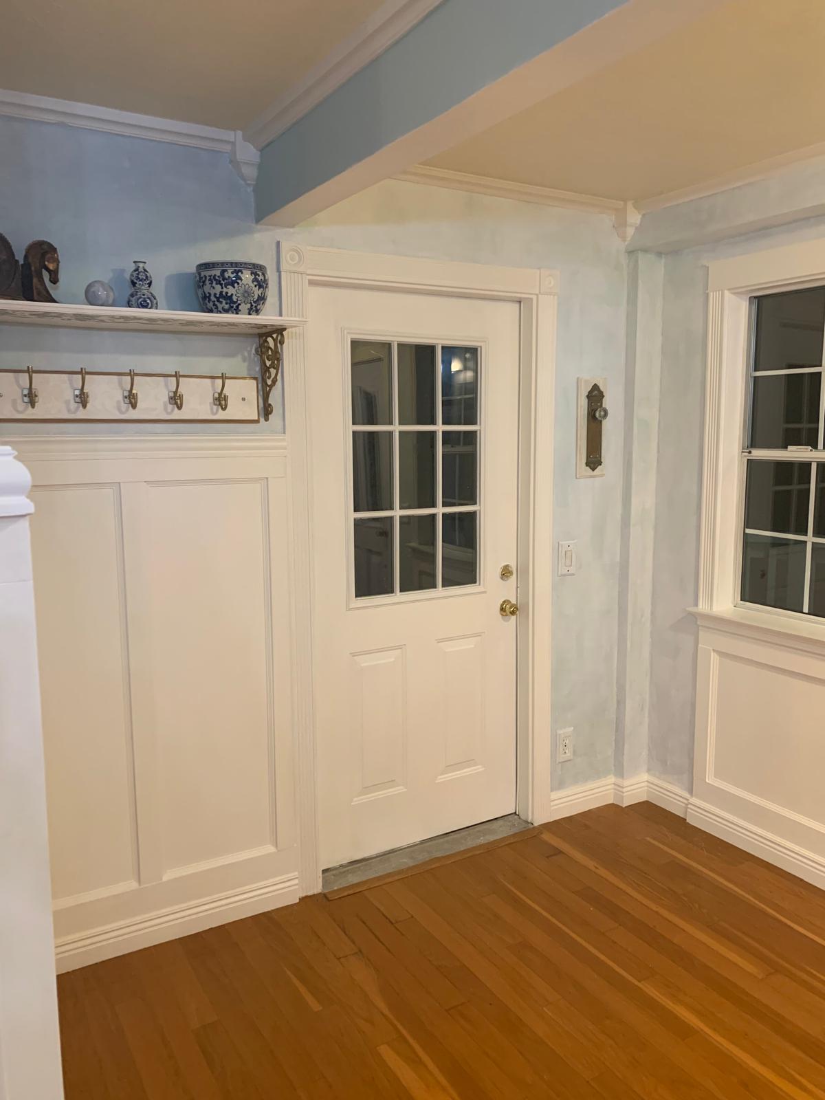
An entry may be small, but it introduces the entire house.
This was the entry of my 1952 farmhouse in California. It was not a grand foyer, nor did it need to become one. What it needed was definition—a stronger architectural presence and a warmer sense of arrival.
The original space was plain and somewhat unresolved. An earlier yellow paint treatment from the late 1990s had brought cheerfulness to it for a time, but the walls still did little to distinguish the entry from the rooms around it. A small farmhouse cannot afford to have square footage that feels like an afterthought.
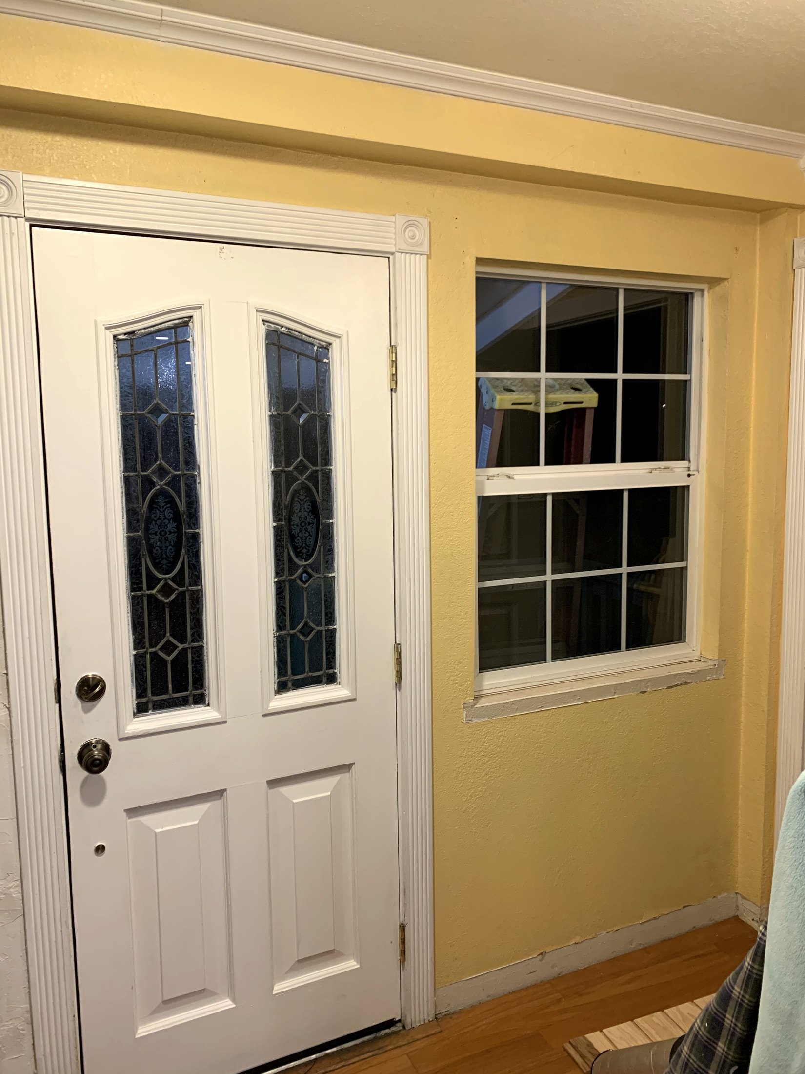
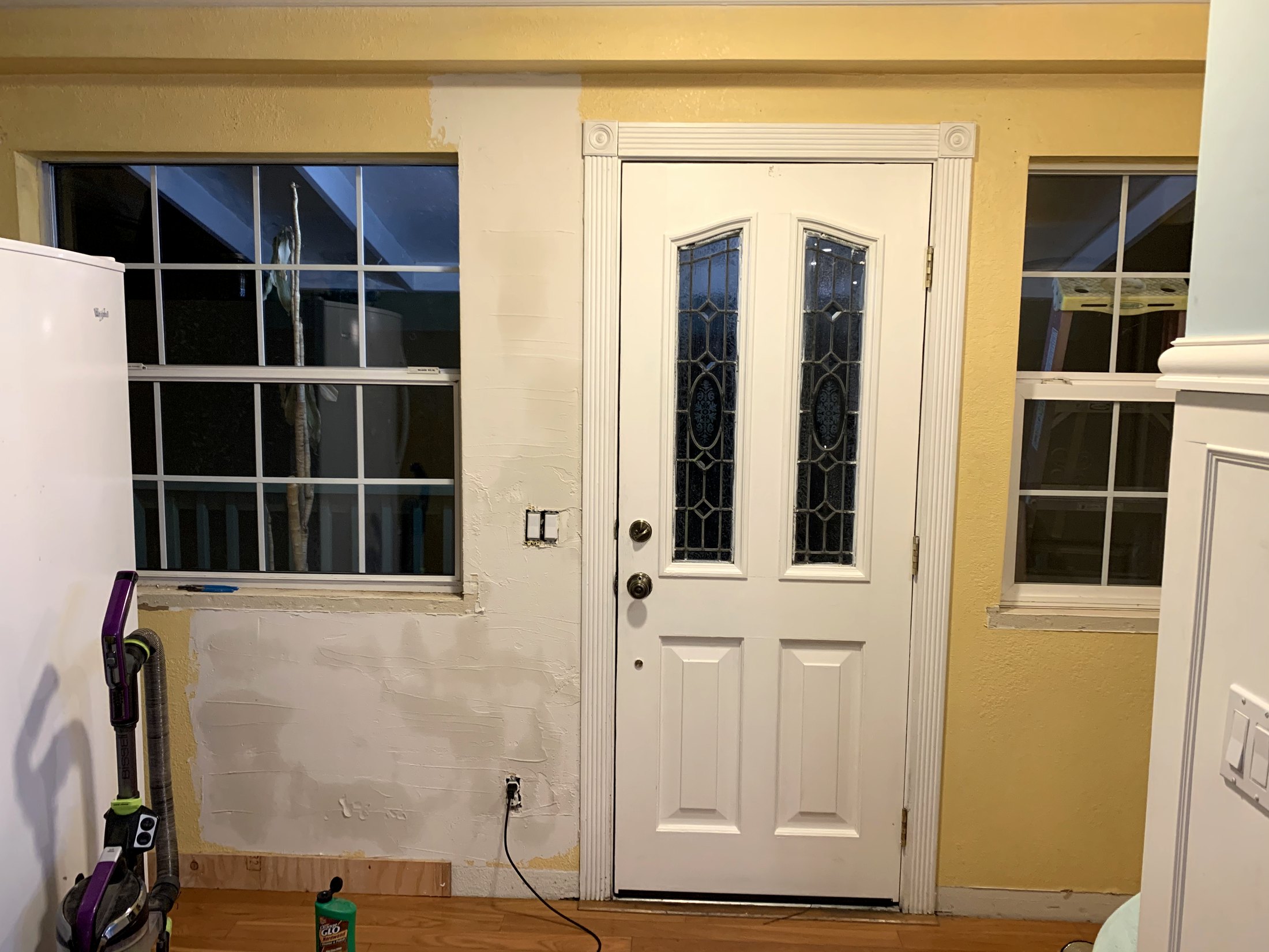
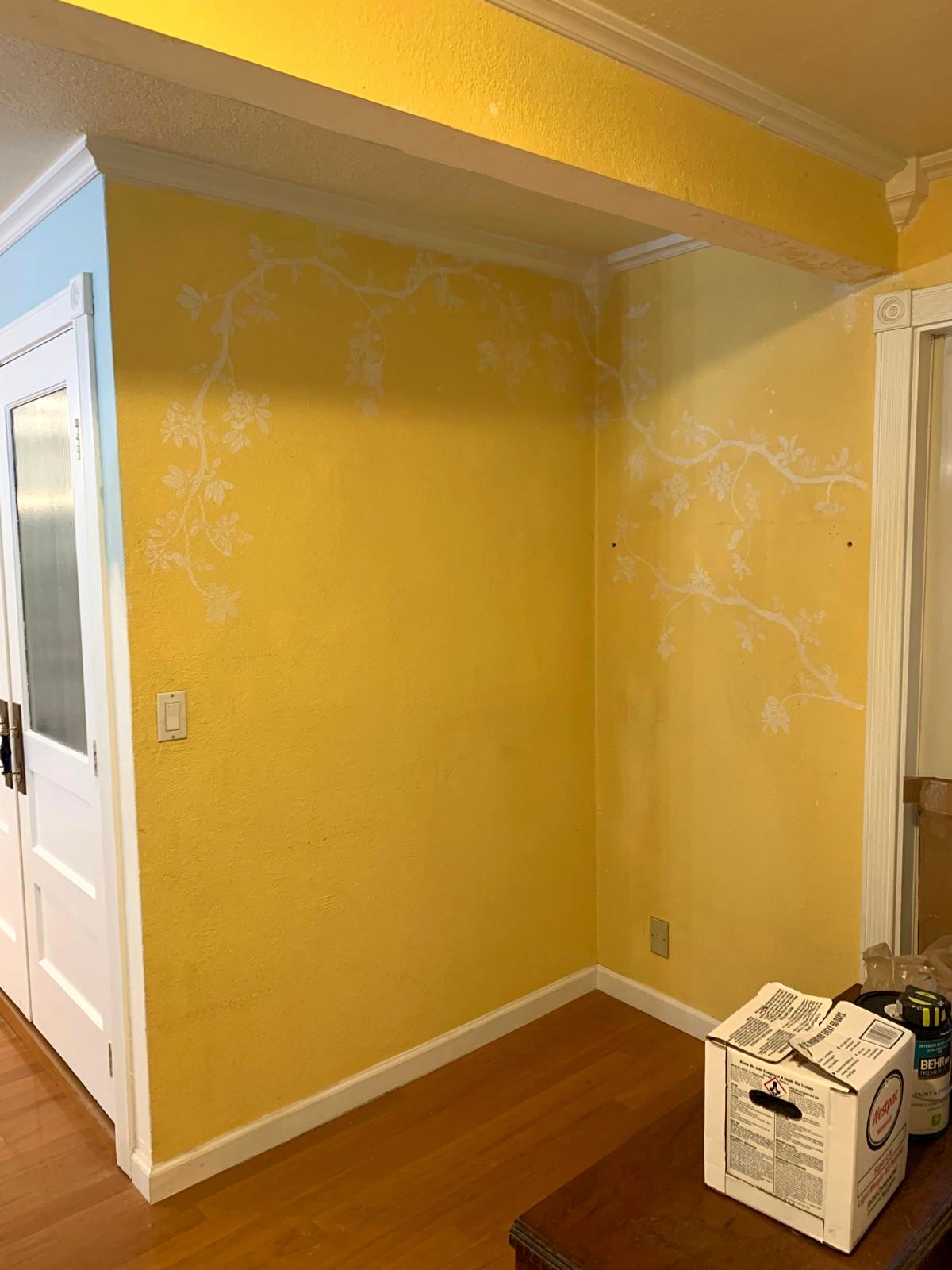
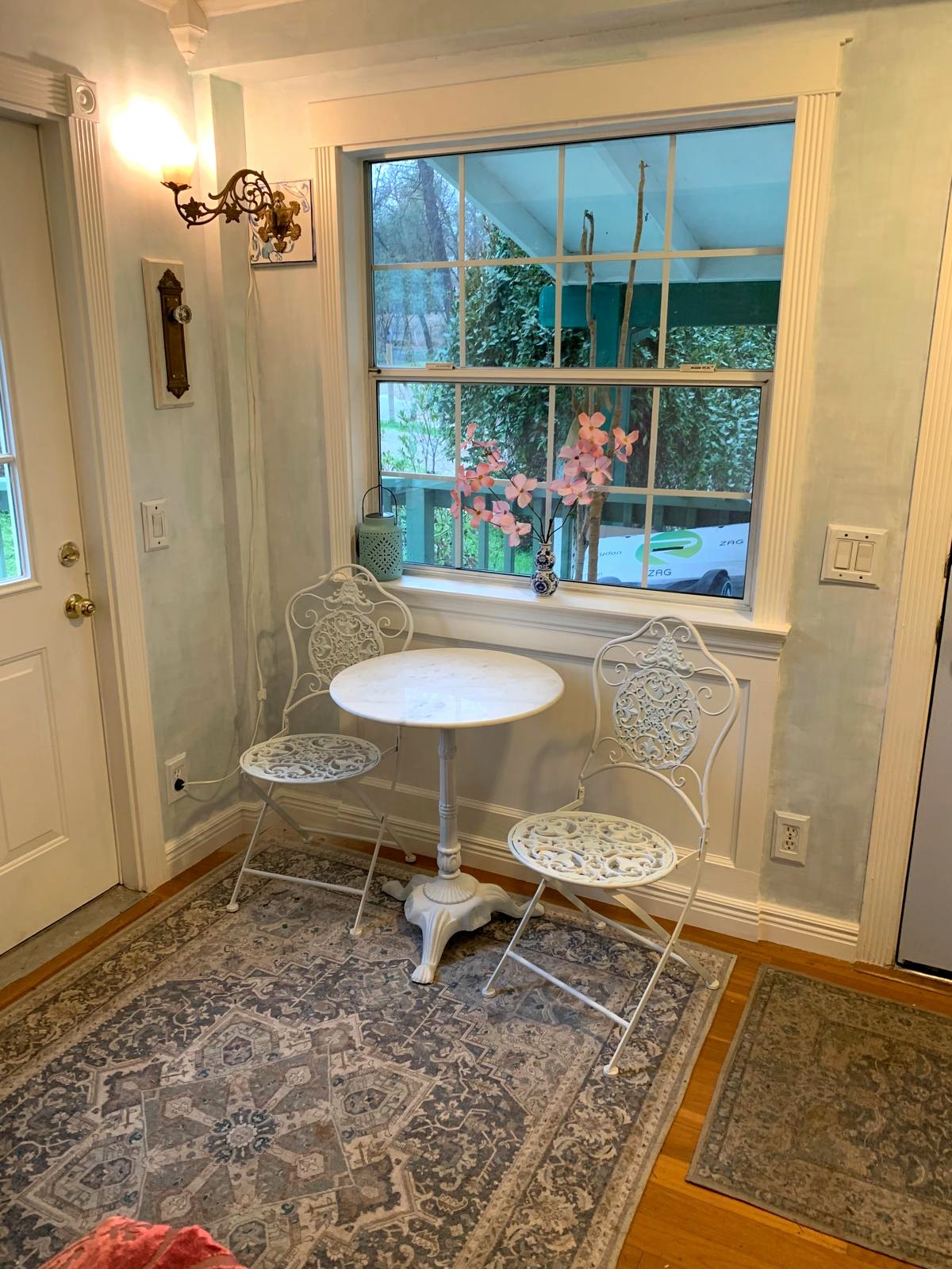
“The goal was not to make the entry feel larger. It was to make the space it already had feel intentional.”
The First Thing You Saw
Because this part of the house had once been outside, the electrical breaker box was positioned directly along the route into the laundry. Its open, utilitarian face was one of the first things you saw. It was necessary, but there was no reason it needed to remain an ugly interruption in the entry.
I had sourced an antique built-in ironing board from another older home in Placerville. The laundry room itself did not have enough space for a freestanding board, so I installed the antique ironing board in the entry wall beside the breaker box. It used an overlooked stretch of wall while keeping the board close to where it was needed.
Then I copied the proportions and character of the ironing-board door to make a companion door for the breaker panel. The two enclosures began to read as a deliberate pair rather than one charming antique beside one exposed modern necessity.
That solution is a small example of how I think about a house. Function does not have to be hidden carelessly, and beauty does not have to occupy space without doing anything. The best answer can solve both problems at once.
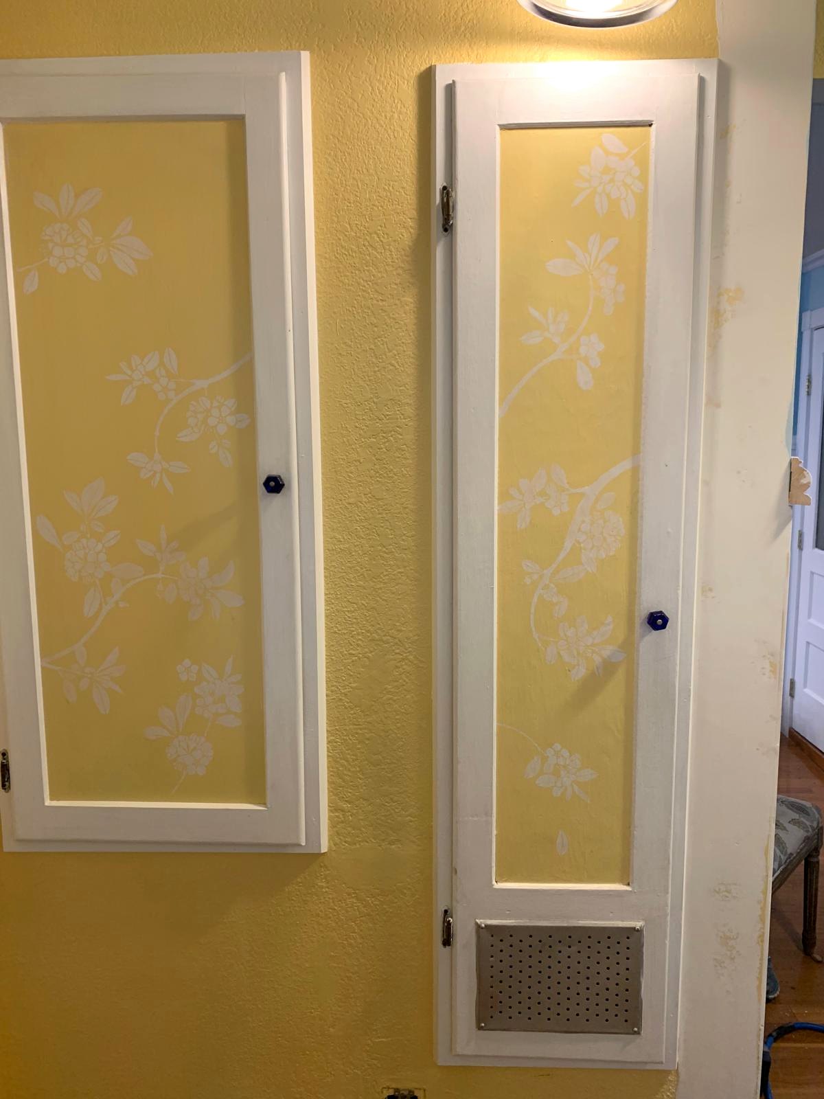
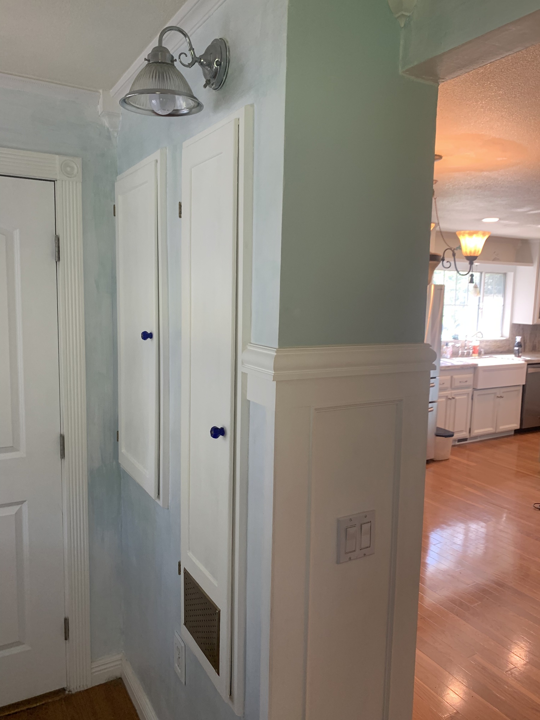
The small glass knobs were chosen in cobalt blue to echo the blue-and-gold antiques in the house and an antique reproduction I brought home from London when I first met my husband. They add a personal memory to two practical doors without asking for much attention.
The Difference Architecture Makes
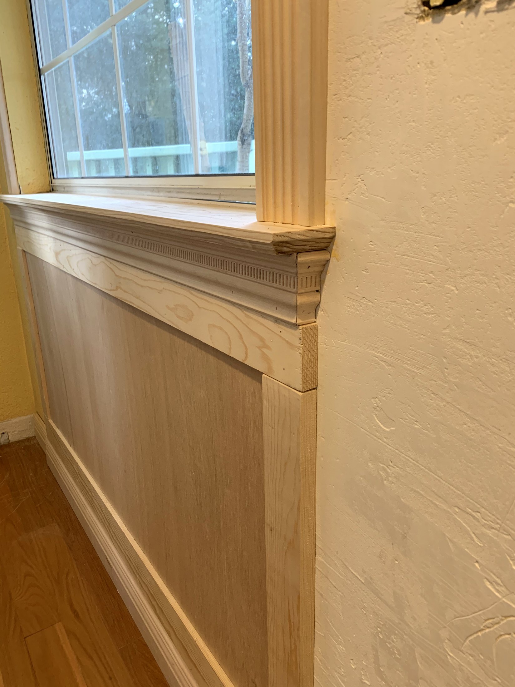
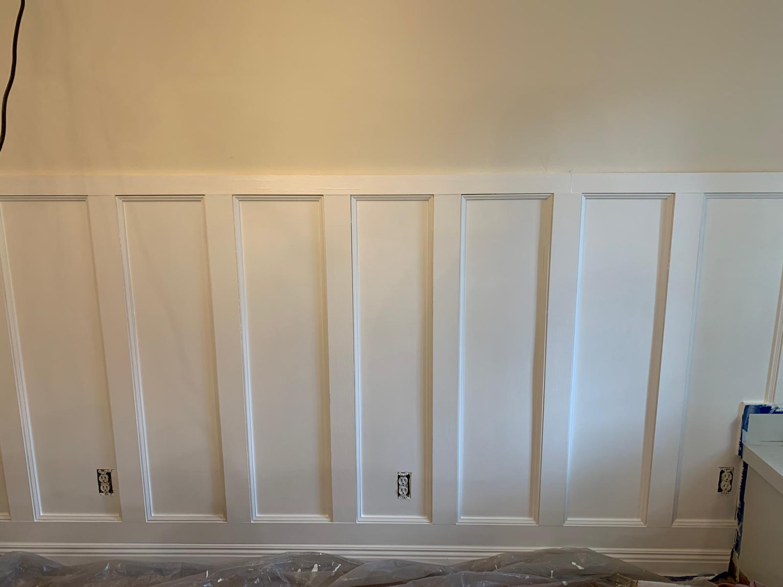
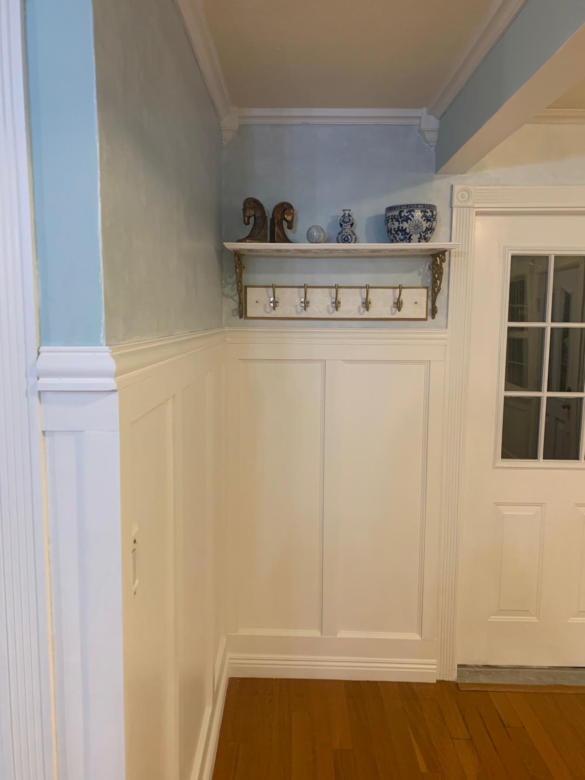
The practical intervention came first, but it did not complete the room. I designed and completed all of the wall paneling myself. The new millwork gave the entry proportion, rhythm, and a visual connection from one wall to the next.
Panel molding and carefully placed rails created structure without making the compact space feel crowded. More substantial trim around the doors and windows helped the different openings read as part of one composition rather than a collection of unrelated necessities.
Painted white, the millwork reflects light and gives the lower portion of the room a sense of permanence. The soft blue above it keeps the entry light and calm.
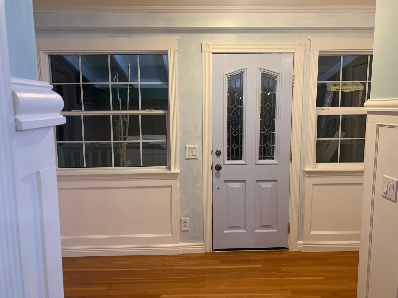
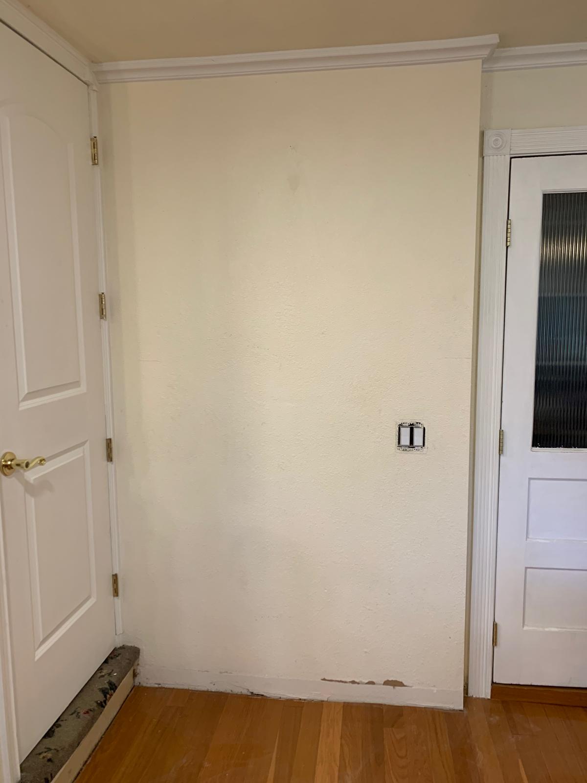
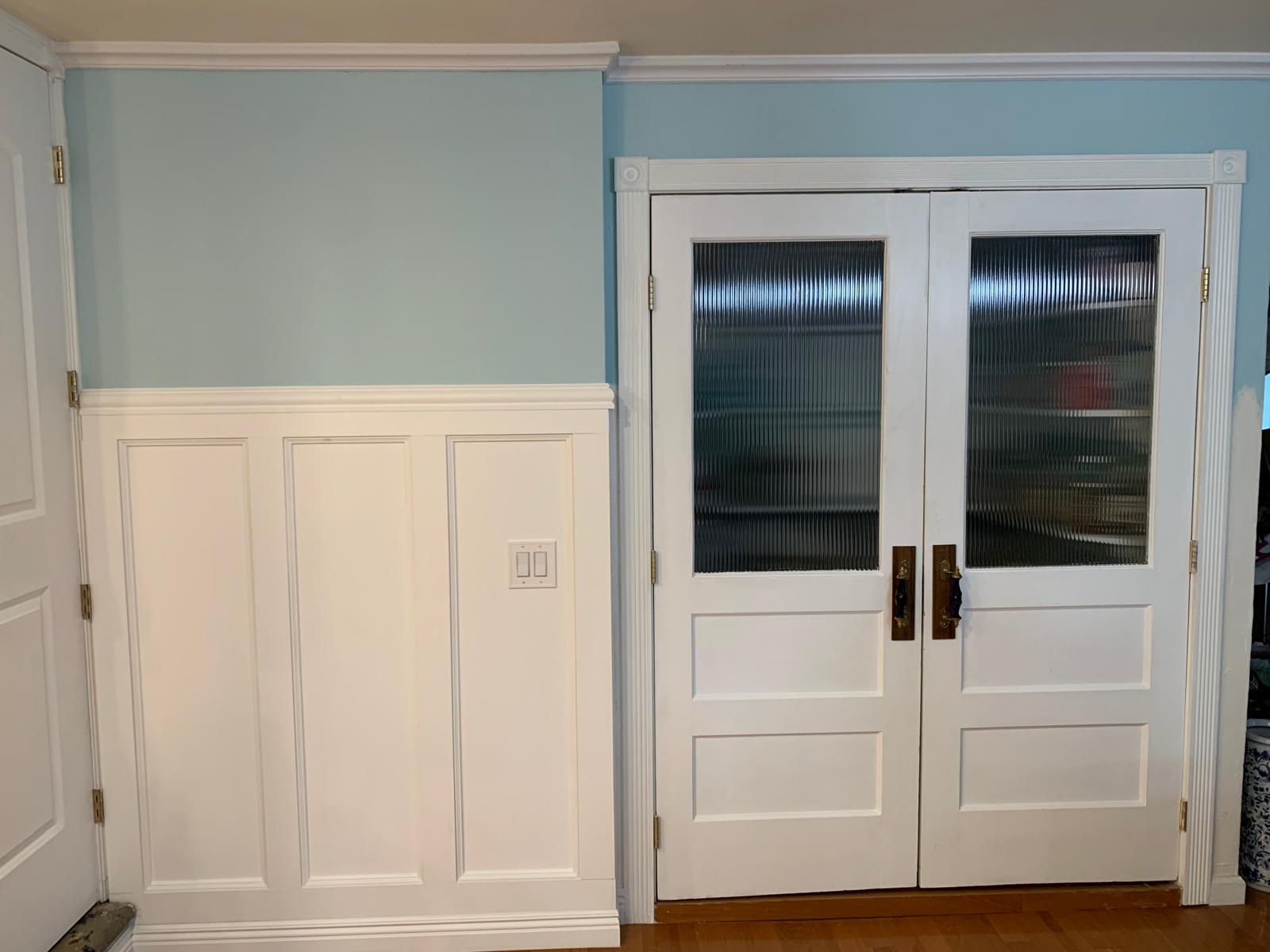
Before, During, and After
The clearest transformation appears beside the pantry doors. What began as a bare wall became a fully integrated part of the entry.
Old Doors, Given Another Purpose
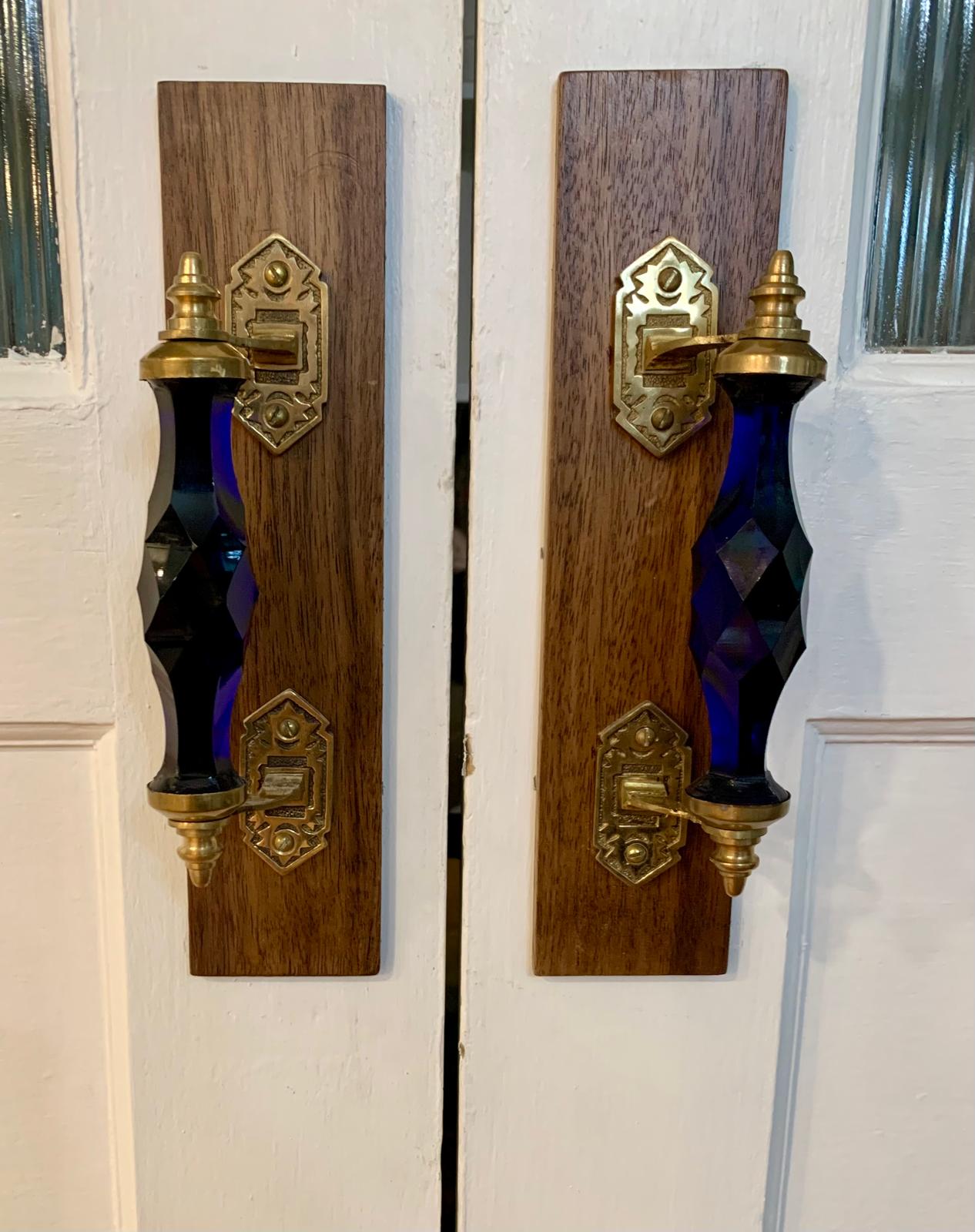
The pantry doors were antique doors from an older house. Repurposing them allowed a necessary storage opening to become one of the most distinctive architectural moments in the entry.
Their ribbed glass gives the pantry privacy while preserving a sense of lightness. The large cobalt-blue glass handles are mounted on walnut backplates with aged brass fittings. The walnut gives the hardware enough visual weight for the substantial pantry doors, while the blue glass relates to the much smaller cobalt knobs on the ironing-board and breaker-box doors.
They were not original to this farmhouse, but their age and proportions help them feel as though they have always belonged there. That is often what I am looking for when I reuse an architectural element—not a perfect historical match, but a convincing conversation between the old piece and its new home.
Then the Entry Could Become Personal
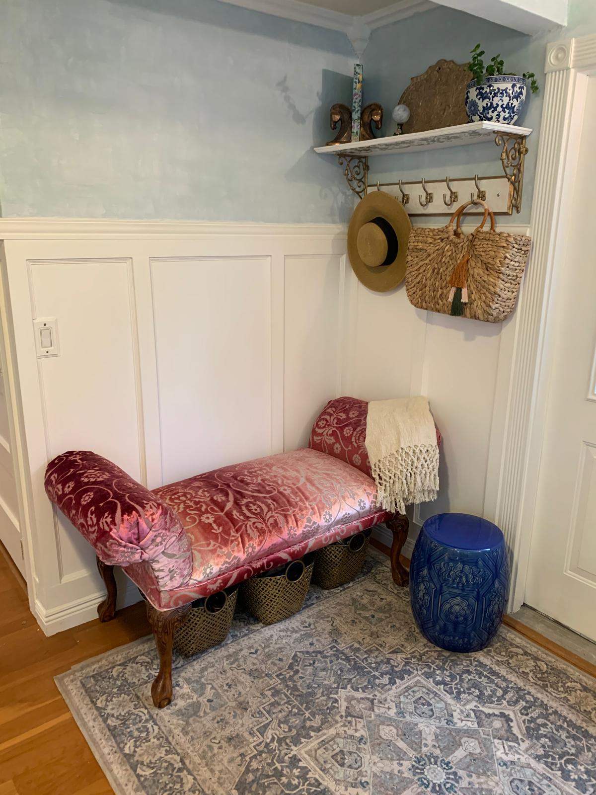
Once the architecture was in place, the room could hold the softer layers of daily life: a rug underfoot, baskets for shoes, hooks for hats and market bags, blue-and-white ceramics, and the small pink seat that I reupholstered myself.
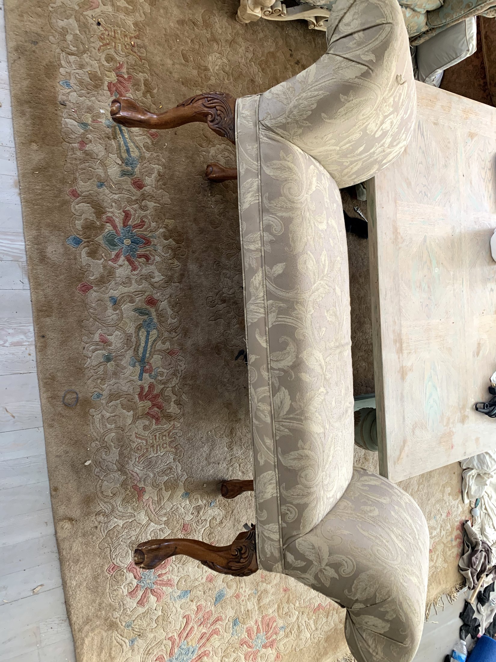
The chair had been cream before I reupholstered it in pink. It sits across from the little bistro table, and together they allow the former porch to retain a trace of its outdoor-room character while working as a miniature mudroom. There is a place to sit, remove shoes, leave a market bag, or pause by the window instead of simply passing through.
The pink upholstery brings warmth and a little romance to the blue and white palette. More importantly, the seat gives the entry a human purpose. The baskets below it keep shoes from drifting across the floor, while the hooks give everyday things a place to land.
I do not think the chair is separate from the architectural story. It is what happens after the architecture has done its work. The paneling makes the space feel like a room; the chair makes it feel like someone lives there.
Storage Made for This Family
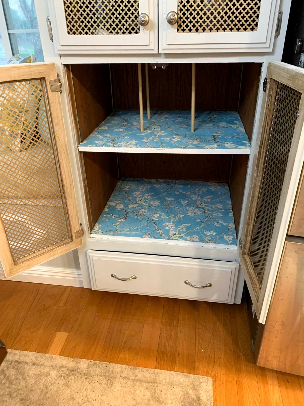
One cabinet was organized specifically for baking trays and pans. My mother, my sister, my daughter, and I have always loved to bake, so the storage was planned around something our family actually did rather than around a generic cabinet diagram.
The remaining pieces of the Van Gogh Almond Blossom wallpaper were used to line the shelves. Even inside a working cabinet, an offcut from another room could be useful, personal, and too beautiful to waste.
A Small Room With a Clear Welcome
This project did not add square footage. It changed how the existing square footage felt.
The entry became more useful, more inviting, and more connected to the character of the 1952 farmhouse. Its interest comes from a combination of things: new millwork made by hand, antique doors from another house, practical storage, color, pattern, and one reupholstered piece of furniture.
A small room does not need to be overlooked. Sometimes it simply needs enough architectural thought to become itself.